Product sustainability in a Sankey diagram
At Questionmark, we research the sustainability of product in (Dutch) supermarkets. On one side, we communicate that to consumers by showing ratings from 1-10 in our app and website.
This needs to be easy enough to understand for people to make quick choices, and provide enough detail to understand what the ratings tell. At the other side, we show suppliers and producers why their products get these ratings - and provide information on how they could make their products more sustainable.
Some experiments
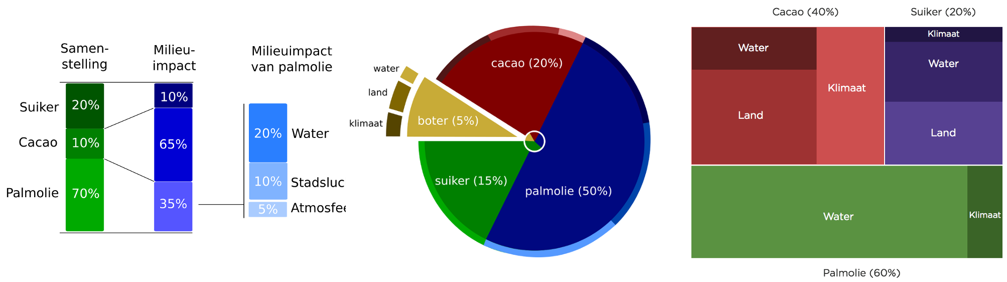
The ‘impact’ or ‘risk’ of a product is the total of its ingredients, packaging, refrigeration and processes. Each is analysed on a number of themes and sub-themes. This is explained in more detail on our website. Now how can we display this in detail without drowning in the details? We’ve experimented with different ways, from different hierachy layouts like a treemap, to combinations of pie- and bar-charts. Here are some ideas that didn’t make it:
Sankey diagram
Now at first, there was some debate whether we could put all impact scores in one diagram, whether they are comparable at all (I’ll save that discussion for another time). But since we combine everything into a single rating anyway, it is possible on the product-level. And so we got to the Sankey-diagram. This kind of diagram usually shows how processes turn inputs into outputs (e.g. in IEA’s world energy balance), but here we’ll use it to show how a total risk on something undesirable in the world consists of various themes and sub-themes.
This chart shows on the left the total impact or risk. This is divided into the different themes that a product is scored on, here that’s environment and human rights. In this case (is a dummy chocolate bar) both environment and human rights have a similar rating. Now environment is divided into a number of sub-themes, and here land use is the one where there may be the most problems. Following the lines, you can see that this relates to cocoa (butter and mass). For human rights, you’ll see that all sub-themes are of similar importance.
So we hope that this diagram gives both a general idea of how a product can be improved in terms of sustainability, as well as provide detail. In our portal for producers, QM Closeup, we use this to explain the sustainability of products (and provide more information on and references for each theme and sub-theme)
d3.chart.sankey
This Sankey diagram is not really specific to our use-case. And, thankfully, there already was an implementation based on d3. But d3-based charts are not really that re-usable by default. One approach to improve that is d3.chart, which provides a way to create reusable and extendable charts. And so d3.chart.sankey was born, to make it easy to create customizable Sankey diagrams.
And if you like to play around with its different options, look here.